
如果想实现一个固定宽度的容器内,根据文字多少自动缩放文字大小的需求,你会怎么做?
首先,肯定想到的是用 JavaScript 去计算文字总宽度,然后进行缩放,因为没有 CSS 可以有办法去计算这个过程。
下午翻看 Chrome 的更新日志,发现已经支持 Container Query 了,通过 Can i use 也可以看到最新版浏览器都已经支持了。
并且留意到这么一句话:
dimensions of a query container. The units include: cqw, cqh, cqi, cqb, cqmin, and cqmax.
What's this? I can not find cqw on MDN!!!
所以直接去 w3 看定义了,果然发现了相关的说明
忽然有了一个大胆的想法!
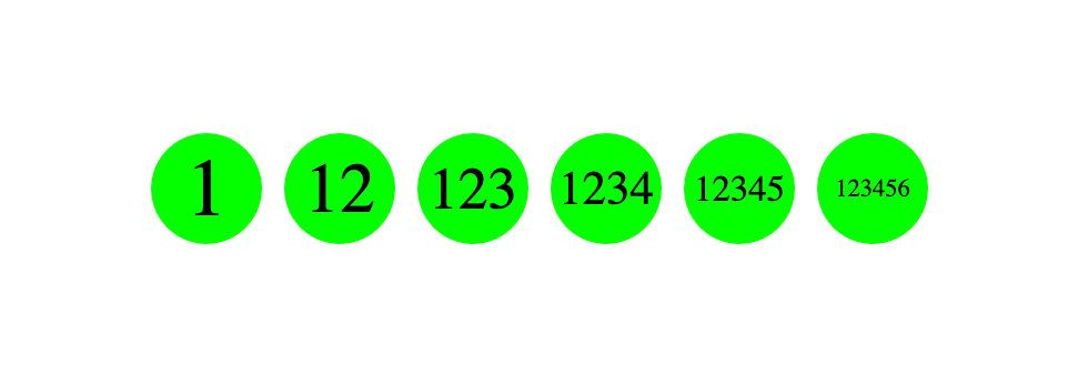
如果可以拿到父级元素宽度的百分比大小,那如果我用一个元素撑开容器,然后元素内再有一个 Container 容器节点用来做计算,是不是就可以实现文字占的位置宽度越宽,文字就越小?
 const Avatar = ({ children }: { children: ReactNode }) => {
  return <div className='avatar'>
    <div className='avatar-text-width' data-content={children}>
      <div className='avatar-text-wrapper'>
        <span>{children}</span>
      </div>
    </div>
  </div>
}如上,比较常见的文字头像,avatar-text-width 用伪元素撑开容器,avatar-text-wrapper 用作计算的 Container。
.avatar {
    width: 50px;
    height: 50px;
    border-radius: 50%;
    background-color: lime;
    white-space: nowrap;

    display: flex;
    justify-content: center;
    align-items: center;
}

.avatar-text-width::before {
    content: attr(data-content);
    font-size: 32px;
    visibility: hidden;
}

.avatar-text-width {
    position: relative;
}

.avatar-text-wrapper {
    position: absolute;
    inset: 0;
    display: flex;
    justify-content: center;
    align-items: center;

    container-type: inline-size;
}

.avatar-text-wrapper span {
    font-size: calc(42px - 32cqw);
}
重点代码是这句:font-size: calc(42px - 32cqw);
但是比较尴尬的是,虽然实现了效果,但是还没法计算出公式,现在的算法是估摸着调出来的 ˃̣̣̥᷄⌓˂̣̣̥᷅